Simplifying document management
We set out to create a clearer, more efficient way for clients to navigate and interact with their financial documents.


After the initial launch of Bessemer's new financial dashboard, feedback from clients and internal teams highlighted several pain points. The process for requesting and receiving documents via email felt disjointed, and users struggled to find specific documents.
To address this, we redesigned the documents page to improve discovery, enable multi-downloads, and make sorting and filtering easier.
Clients struggled to manage and access important documents such as tax forms, account statements, and financial reports. Patterns did not align with clients expected to organize or track critical paperwork. This led to delays, unnecessary calls to client advisors for clarification, and overall frustration with the experience.
Difficult to locate key documents
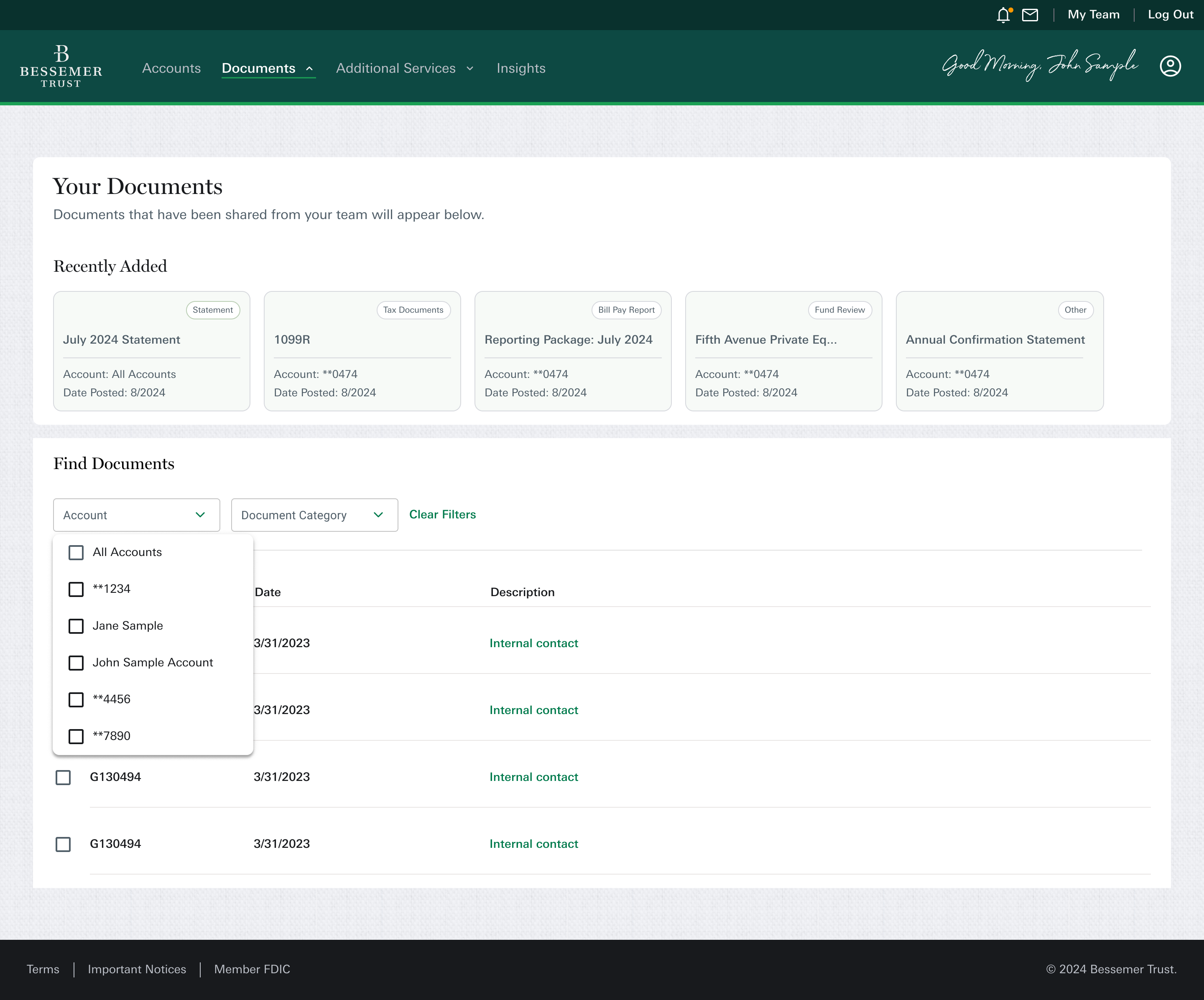
Clients had trouble finding specific documents—like a quarterly statement or a tax form—when they needed them. The document section lacked structure and hierarchy, which made navigation slow and confusing.
Limited sorting and filtering options
There were very few ways to sort or filter documents (e.g., by date, type, or account). This made it hard for clients to quickly narrow down what they were looking for, especially when managing multiple accounts or years of records.
No option for multi-file downloads
Clients couldn’t download multiple documents at once, such as all tax documents for a given year. Instead, they were forced to download each file individually, which made the process tedious, repetitive, and time-consuming.
No visibility on recent uploads
Clients weren’t notified when new documents were added by their advisors or team members. Without a way to easily see what was new, clients often missed time-sensitive updates or had to repeatedly ask if something had been uploaded.
Quick Win: Multi-download functionality
While rethinking the overall structure and filtering system, we also took the opportunity to address a smaller—but highly frustrating—pain point for clients: the inability to download multiple documents at once.
This was a frequent complaint and a clear source of friction, especially during tax season when clients needed to access several files at once. The solution was straightforward from a technical perspective, so we prioritized it as a quick win that could deliver immediate value.
We introduced a multi-select download option, allowing clients to choose several documents from the list view and download them in one action. Though simple, this feature significantly improved usability and reduced the repetitive, manual effort that previously caused frustration.
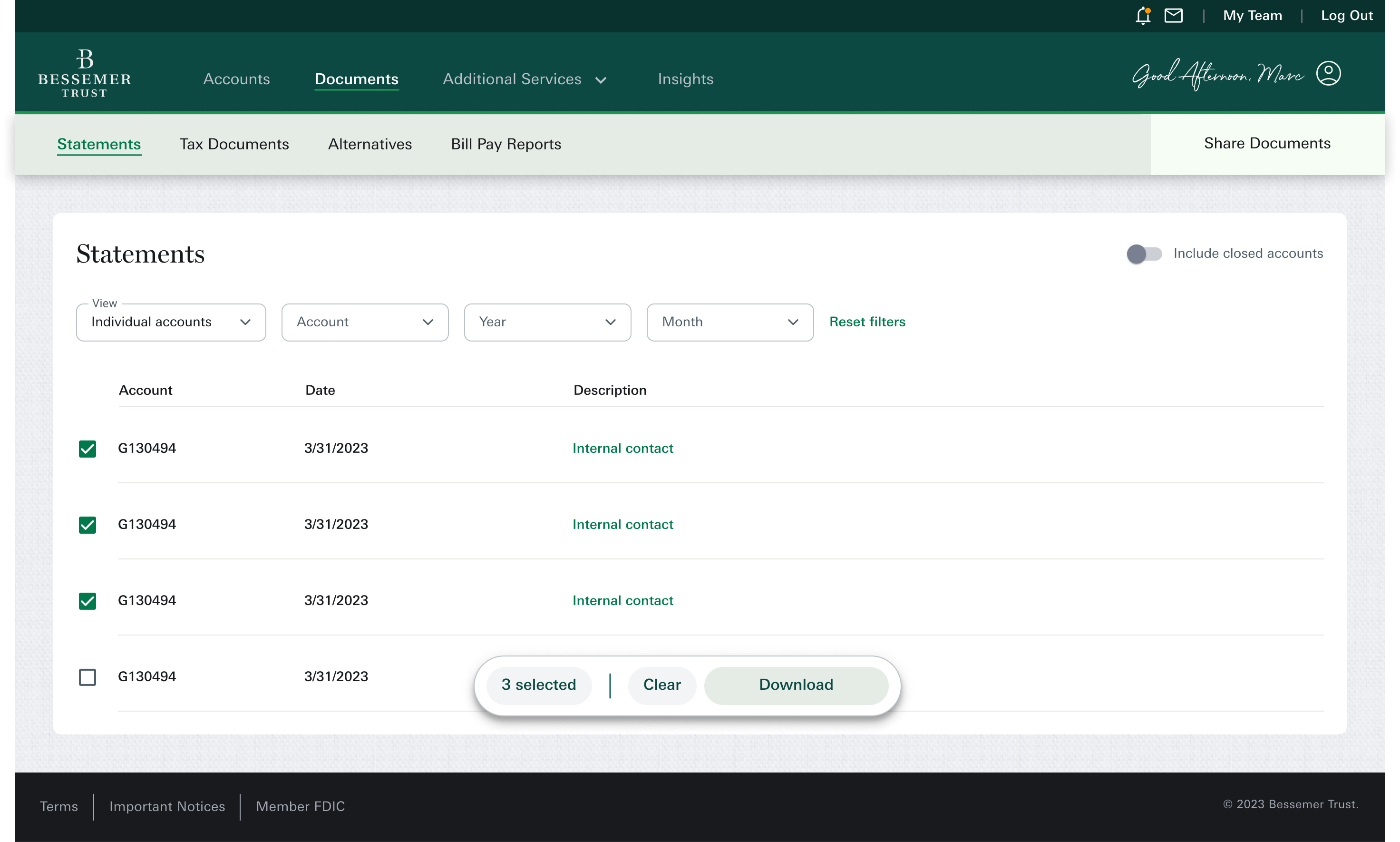
By balancing larger structural improvements with low-effort, high-impact enhancements like this one, we were able to boost client satisfaction even before the full redesign was fully kicked off.
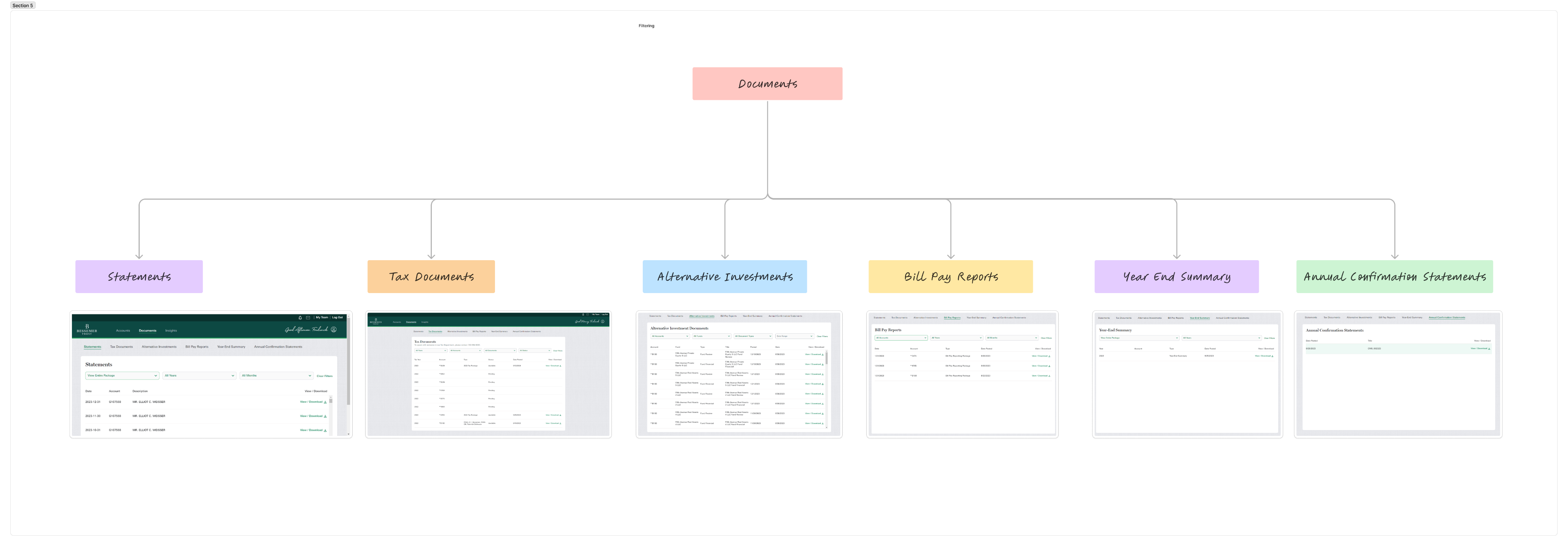
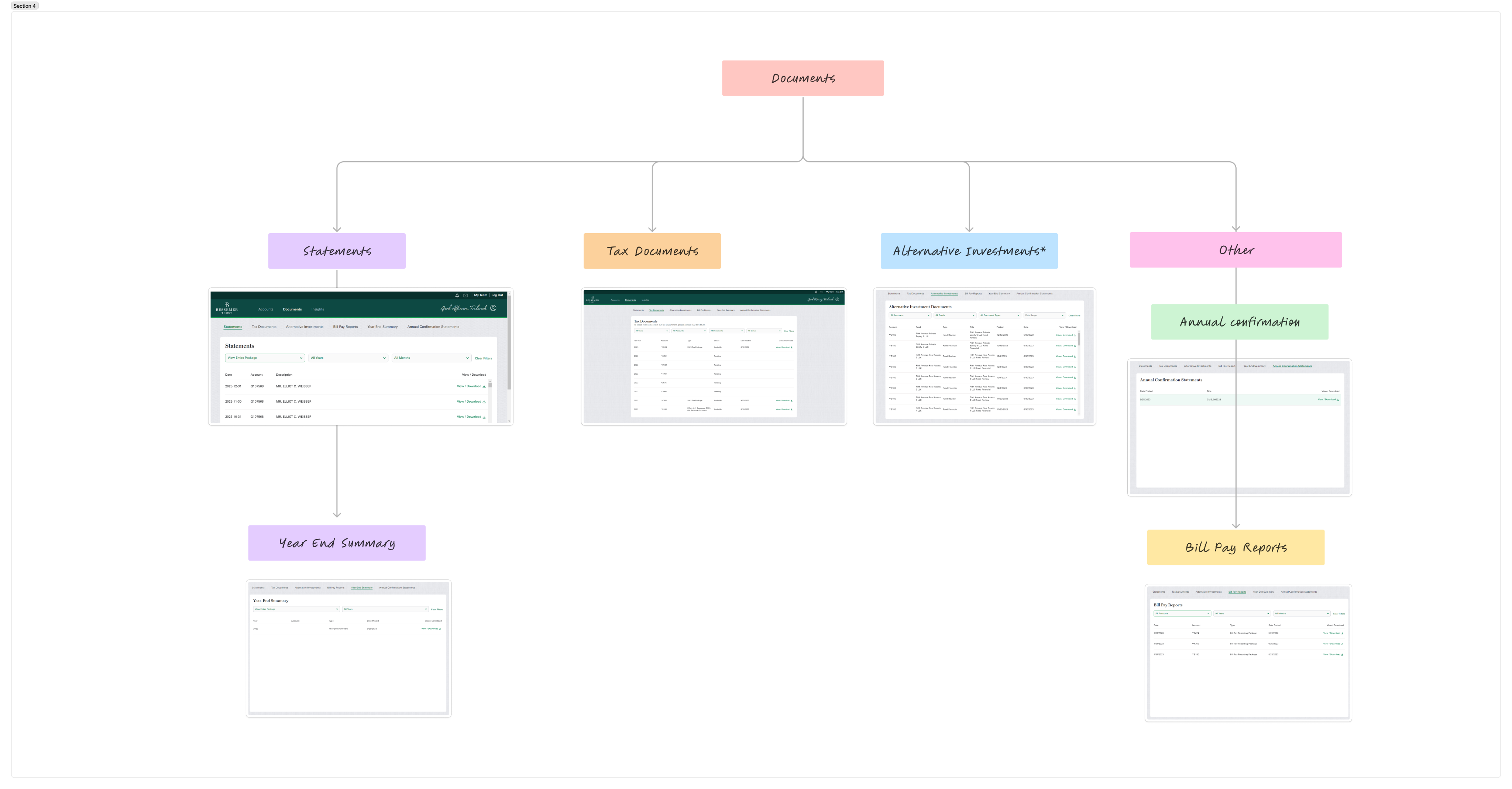
Document organization based on client usage data
For phase two, we needed to understand how clients looked for documents, I started by mapping out the existing structure and identifying key content groupings.
To inform decisions around page structure and filtering, I reviewed usage analytics to understand which document categories clients interacted with most. The data revealed that Statements and Tax Documents received significantly more engagement compared to other categories like Alternative Investments, ACS, and year-end summaries.
Document type
% of users on page
ACS
Alternative
Investments
Bill Pay
YES
Statements
Tax


This insight helped me prioritize which categories needed stronger filtering and visual hierarchy, and which could be consolidated in the layout. We streamlined the experience into three core categories, keeping alternative investments separate since only certain clients access them.
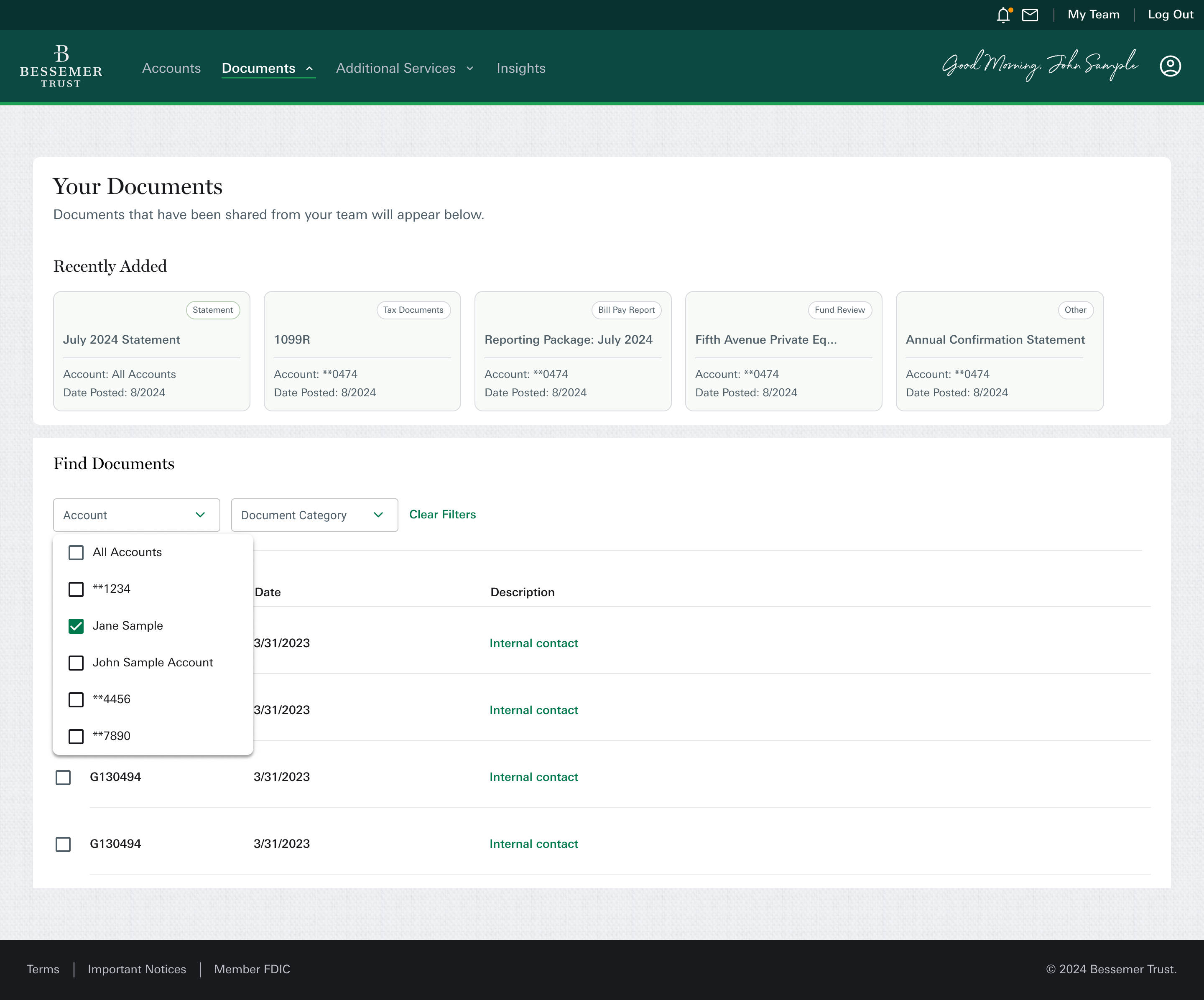
Reorganization of documents
I started by mapping out the existing structure and identifying key content groupings. I reorganized document types into clearer categories and eliminated unnecessary branches. This helped simplify navigation and aligned the dashboard with users’ mental models.
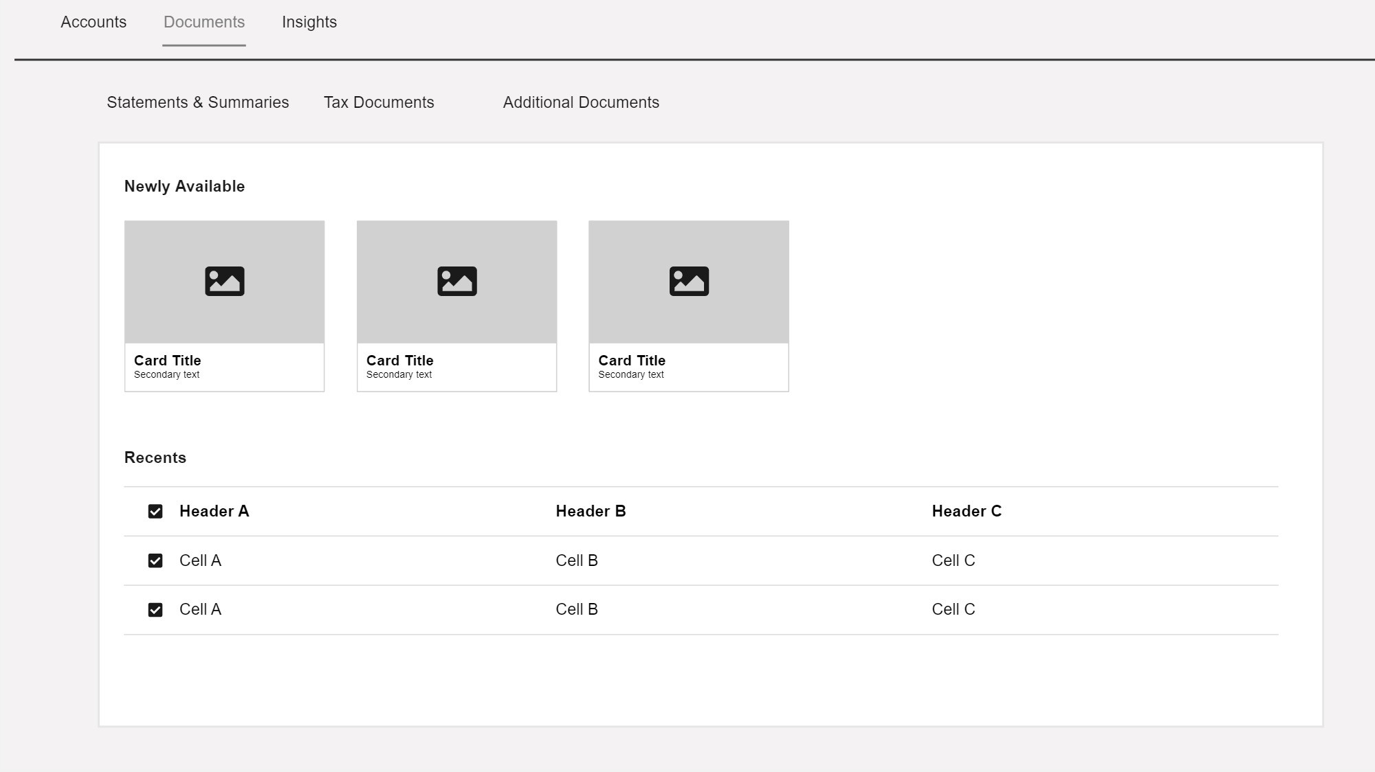
Low fidelity wireframing
With the issues identified, I moved into the design phase. I started by sketching and gathering inspiration, focusing on how to improve the layout. The page had a repetitive table design with little visual interest, so I aimed to introduce a card-based layout to highlight recently uploaded documents from the financial team. This not only added visual appeal but also made it easier for users to quickly find the most relevant documents.
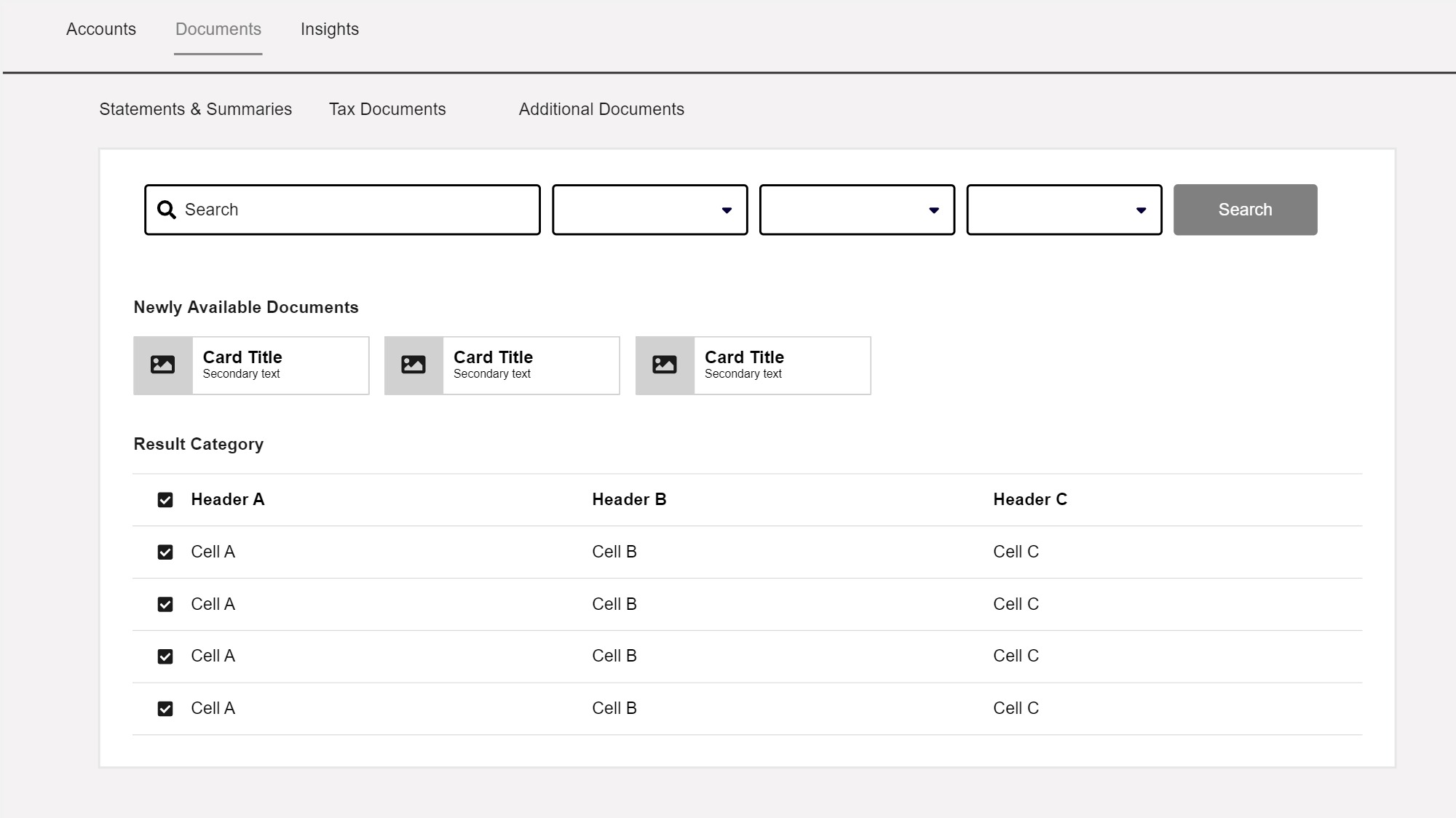
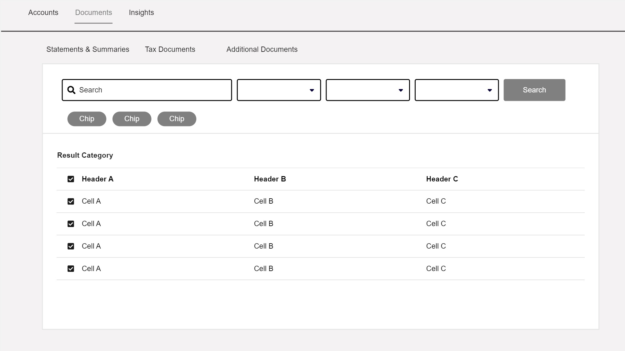
Solution
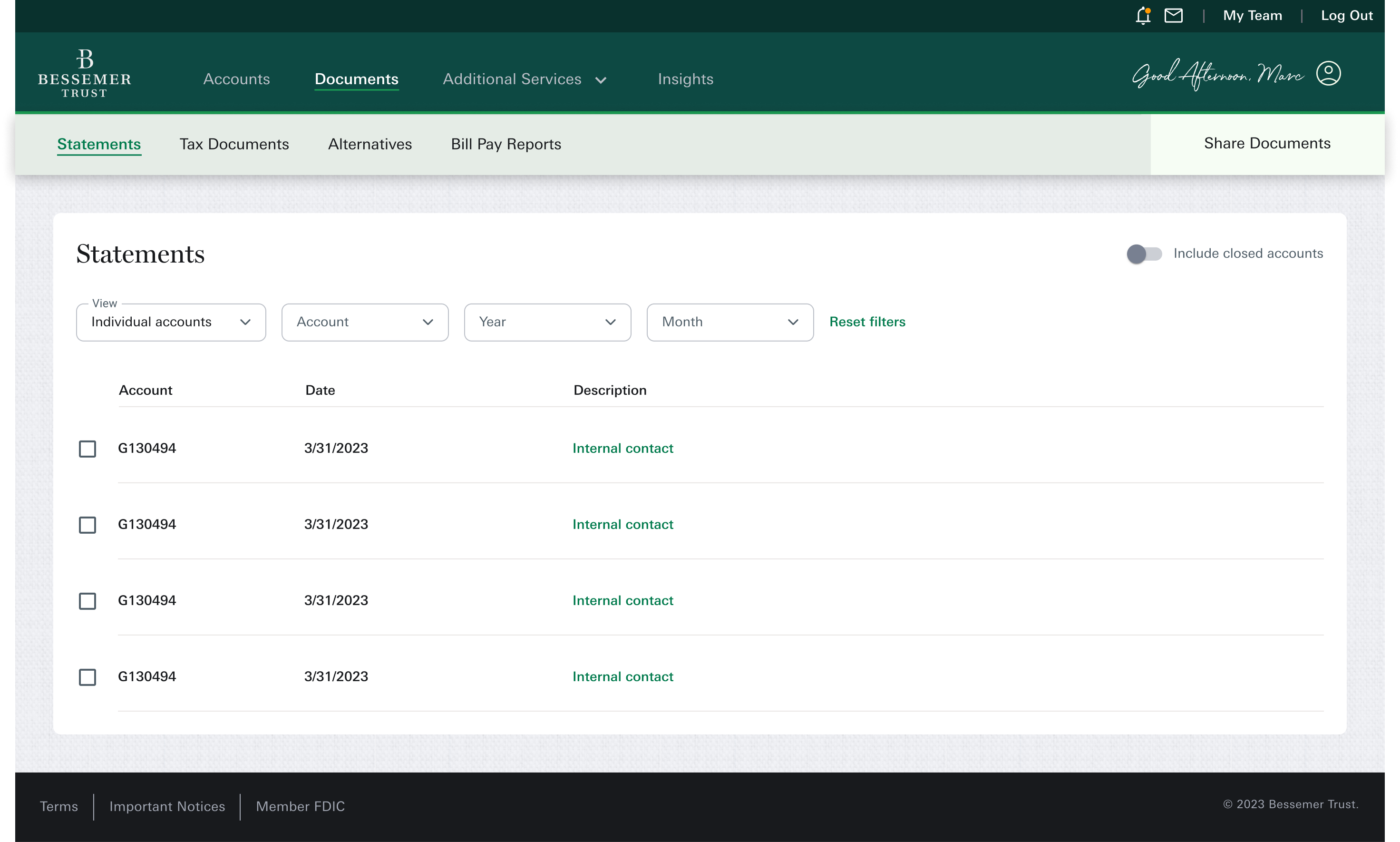
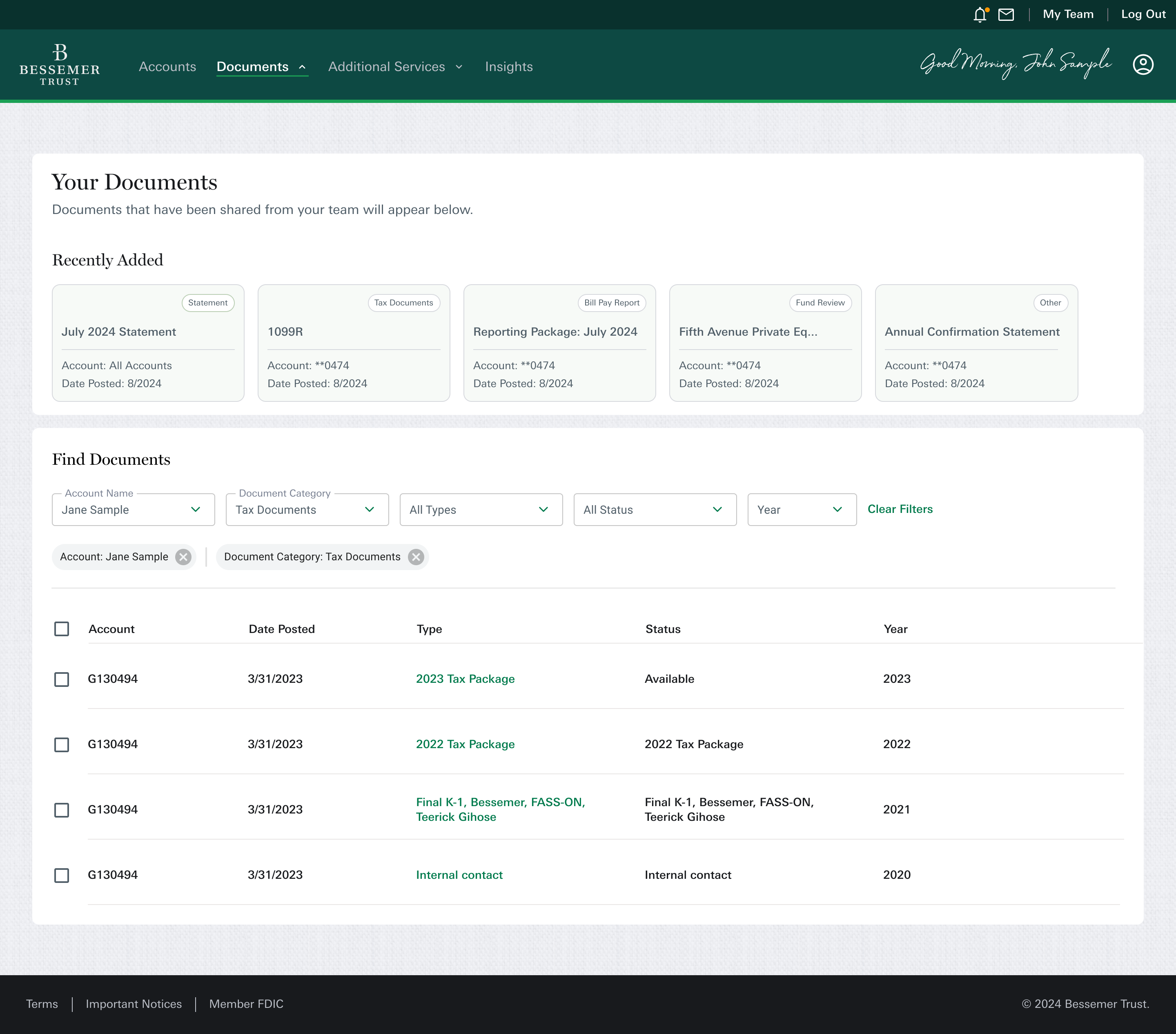
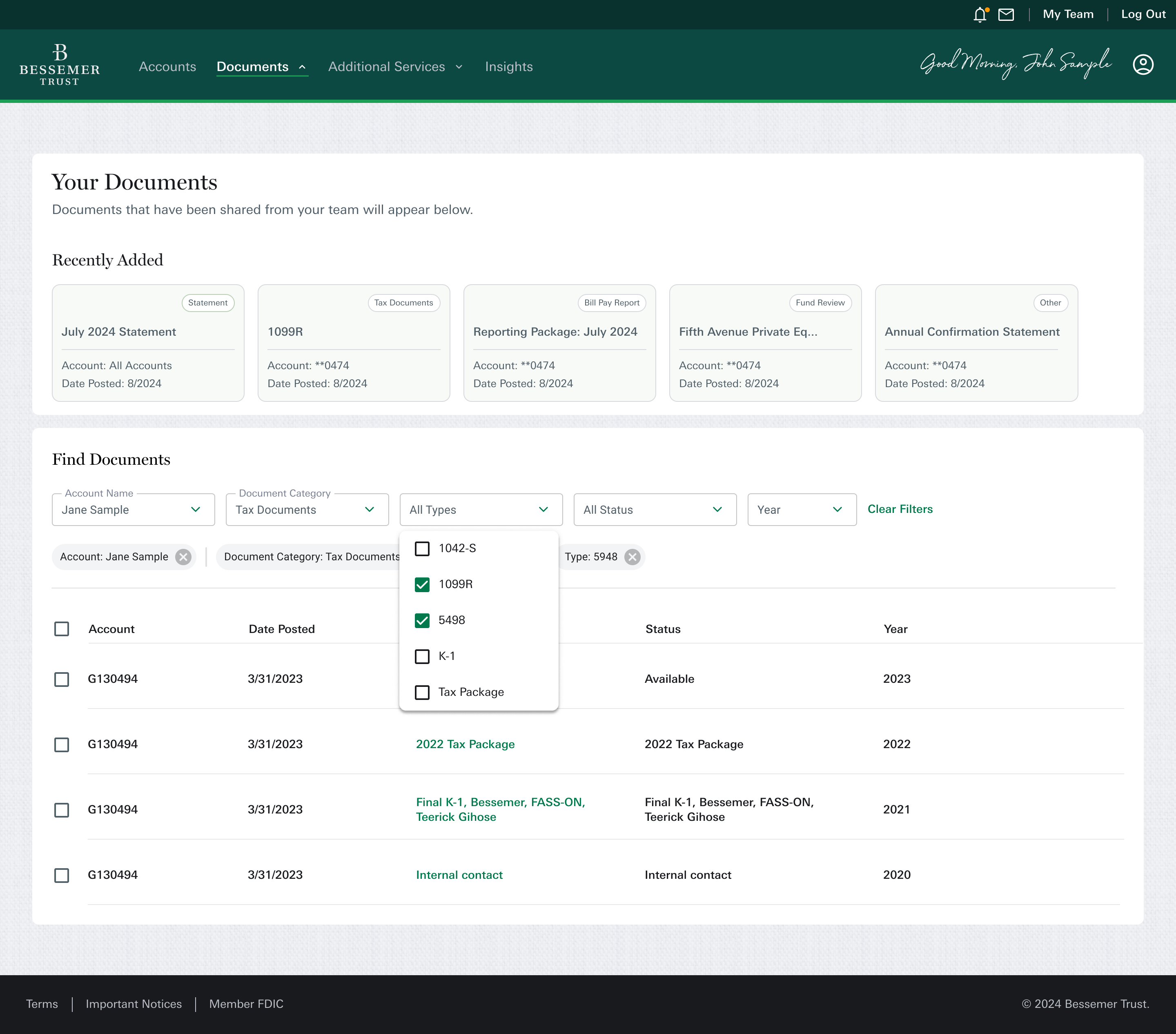
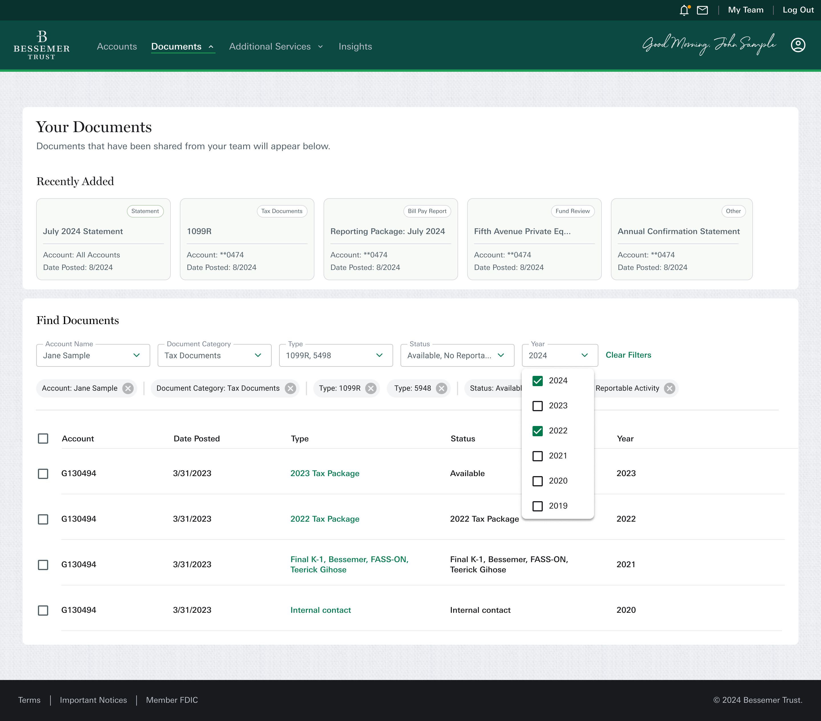
Next, we focused on improving the filtering system. We introduced progressive disclosure, allowing filters to appear and disappear depending on previous selections. This kept the experience on a single page, reducing complexity and eliminating the need for multiple category pages. Additionally, to aid recognition over recall, we added filter chips to clearly show which filters have been applied.
Reduction in support requests
Fewer calls and emails to client advisors asking where to find documents especially during tax season.
Faster document retrieval
Clients reported being able to find the documents they needed in significantly less time thanks to improved structure and filtering.
Positive feedback from Client Advisors
Advisors noted smoother client interactions and less time spent walking users through the platform.
Higher engagement on key pages
Time spent on redesigned document pages increased, especially for tax and statement categories, indicating better content discoverability.
Reach out for collaboration,
consulting, or coffee.
n.ingrisano8@gmail.com

Simplifying document management
We set out to create a clearer, more efficient way for clients to navigate and interact with their financial documents.

After the initial launch of Bessemer's new financial dashboard, feedback from clients and internal teams highlighted several pain points. The process for requesting and receiving documents via email felt disjointed, and users struggled to find specific documents.
To address this, we redesigned the documents page to improve discovery, enable multi-downloads, and make sorting and filtering easier.
Clients struggled to manage and access important documents such as tax forms, account statements, and financial reports. Patterns did not align with clients expected to organize or track critical paperwork. This led to delays, unnecessary calls to client advisors for clarification, and overall frustration with the experience.
Difficult to locate key documents
Clients had trouble finding specific documents—like a quarterly statement or a tax form—when they needed them. The document section lacked structure and hierarchy, which made navigation slow and confusing.
Limited sorting and filtering options
There were very few ways to sort or filter documents (e.g., by date, type, or account). This made it hard for clients to quickly narrow down what they were looking for, especially when managing multiple accounts or years of records.
No option for multi-file downloads
Clients couldn’t download multiple documents at once, such as all tax documents for a given year. Instead, they were forced to download each file individually, which made the process tedious, repetitive, and time-consuming.
No visibility on recent uploads
Clients weren’t notified when new documents were added by their advisors or team members. Without a way to easily see what was new, clients often missed time-sensitive updates or had to repeatedly ask if something had been uploaded.
Quick Win: Multi-download functionality
While rethinking the overall structure and filtering system, we also took the opportunity to address a smaller—but highly frustrating—pain point for clients: the inability to download multiple documents at once.
This was a frequent complaint and a clear source of friction, especially during tax season when clients needed to access several files at once. The solution was straightforward from a technical perspective, so we prioritized it as a quick win that could deliver immediate value.
We introduced a multi-select download option, allowing clients to choose several documents from the list view and download them in one action. Though simple, this feature significantly improved usability and reduced the repetitive, manual effort that previously caused frustration.
By balancing larger structural improvements with low-effort, high-impact enhancements like this one, we were able to boost client satisfaction even before the full redesign was fully kicked off.
Document organization based on client usage data
For phase two, we needed to understand how clients looked for documents, I started by mapping out the existing structure and identifying key content groupings.
To inform decisions around page structure and filtering, I reviewed usage analytics to understand which document categories clients interacted with most. The data revealed that Statements and Tax Documents received significantly more engagement compared to other categories like Alternative Investments, ACS, and year-end summaries.
Document type
% of users on page
ACS
Alternative
Investments
Bill Pay
YES
Statements
Tax


This insight helped me prioritize which categories needed stronger filtering and visual hierarchy, and which could be consolidated in the layout. We streamlined the experience into three core categories, keeping alternative investments separate since only certain clients access them.
Reorganization of documents
I started by mapping out the existing structure and identifying key content groupings. I reorganized document types into clearer categories and eliminated unnecessary branches. This helped simplify navigation and aligned the dashboard with users’ mental models.
Low fidelity wireframing
With the issues identified, I moved into the design phase. I started by sketching and gathering inspiration, focusing on how to improve the layout. The page had a repetitive table design with little visual interest, so I aimed to introduce a card-based layout to highlight recently uploaded documents from the financial team. This not only added visual appeal but also made it easier for users to quickly find the most relevant documents.
Solution
Next, we focused on improving the filtering system. We introduced progressive disclosure, allowing filters to appear and disappear depending on previous selections. This kept the experience on a single page, reducing complexity and eliminating the need for multiple category pages. Additionally, to aid recognition over recall, we added filter chips to clearly show which filters have been applied.
Reduction in support requests
Fewer calls and emails to client advisors asking where to find documents especially during tax season.
Faster document retrieval
Clients reported being able to find the documents they needed in significantly less time thanks to improved structure and filtering.
Positive feedback from Client Advisors
Advisors noted smoother client interactions and less time spent walking users through the platform.
Higher engagement on key pages
Time spent on redesigned document pages increased, especially for tax and statement categories, indicating better content discoverability.
Reach out for collaboration,
consulting, or coffee.
n.ingrisano8@gmail.com
Simplifying document management
We set out to create a clearer, more efficient way for clients to navigate and interact with their financial documents.

After the initial launch of Bessemer's new financial dashboard, feedback from clients and internal teams highlighted several pain points. The process for requesting and receiving documents via email felt disjointed, and users struggled to find specific documents.
To address this, we redesigned the documents page to improve discovery, enable multi-downloads, and make sorting and filtering easier.
Clients struggled to manage and access important documents such as tax forms, account statements, and financial reports. Patterns did not align with clients expected to organize or track critical paperwork. This led to delays, unnecessary calls to client advisors for clarification, and overall frustration with the experience.
Difficult to locate key documents
Clients had trouble finding specific documents—like a quarterly statement or a tax form—when they needed them. The document section lacked structure and hierarchy, which made navigation slow and confusing.
Limited sorting and filtering options
There were very few ways to sort or filter documents (e.g., by date, type, or account). This made it hard for clients to quickly narrow down what they were looking for, especially when managing multiple accounts or years of records.
No option for multi-file downloads
Clients couldn’t download multiple documents at once, such as all tax documents for a given year. Instead, they were forced to download each file individually, which made the process tedious, repetitive, and time-consuming.
No visibility on recent uploads
Clients weren’t notified when new documents were added by their advisors or team members. Without a way to easily see what was new, clients often missed time-sensitive updates or had to repeatedly ask if something had been uploaded.
Quick Win: Multi-download functionality
While rethinking the overall structure and filtering system, we also took the opportunity to address a smaller—but highly frustrating—pain point for clients: the inability to download multiple documents at once.
This was a frequent complaint and a clear source of friction, especially during tax season when clients needed to access several files at once. The solution was straightforward from a technical perspective, so we prioritized it as a quick win that could deliver immediate value.
We introduced a multi-select download option, allowing clients to choose several documents from the list view and download them in one action. Though simple, this feature significantly improved usability and reduced the repetitive, manual effort that previously caused frustration.
By balancing larger structural improvements with low-effort, high-impact enhancements like this one, we were able to boost client satisfaction even before the full redesign was fully kicked off.
Document organization based on client usage data
For phase two, we needed to understand how clients looked for documents, I started by mapping out the existing structure and identifying key content groupings.
To inform decisions around page structure and filtering, I reviewed usage analytics to understand which document categories clients interacted with most. The data revealed that Statements and Tax Documents received significantly more engagement compared to other categories like Alternative Investments, ACS, and year-end summaries.
Document type
% of users on page
ACS
Alternative
Investments
Bill Pay
YES
Statements
Tax
This insight helped me prioritize which categories needed stronger filtering and visual hierarchy, and which could be consolidated in the layout. We streamlined the experience into three core categories, keeping alternative investments separate since only certain clients access them.
Reorganization of documents
I started by mapping out the existing structure and identifying key content groupings. I reorganized document types into clearer categories and eliminated unnecessary branches. This helped simplify navigation and aligned the dashboard with users’ mental models.
Low fidelity wireframing
With the issues identified, I moved into the design phase. I started by sketching and gathering inspiration, focusing on how to improve the layout. The page had a repetitive table design with little visual interest, so I aimed to introduce a card-based layout to highlight recently uploaded documents from the financial team. This not only added visual appeal but also made it easier for users to quickly find the most relevant documents.
Solution
Next, we focused on improving the filtering system. We introduced progressive disclosure, allowing filters to appear and disappear depending on previous selections. This kept the experience on a single page, reducing complexity and eliminating the need for multiple category pages. Additionally, to aid recognition over recall, we added filter chips to clearly show which filters have been applied.
Reduction in support requests
Fewer calls and emails to client advisors asking where to find documents especially during tax season.
Faster document retrieval
Clients reported being able to find the documents they needed in significantly less time thanks to improved structure and filtering.
Positive feedback from Client Advisors
Advisors noted smoother client interactions and less time spent walking users through the platform.
Higher engagement on key pages
Time spent on redesigned document pages increased, especially for tax and statement categories, indicating better content discoverability.
Reach out for collaboration,
consulting, or coffee.
n.ingrisano8@gmail.com