Building a scalable design system for a growing financial platform
Primary Colors
secondary/dark
#0D4943
secondary/light
#126159
primary/default
#007A4C
primary/light
#1BA055
text/primary/darkest
#181A1D
text/primary/dark
#505E68
text/primary/medium
#788091
text/primary/defualt
#BCC0C8
text/primary/light
#D7D9DE
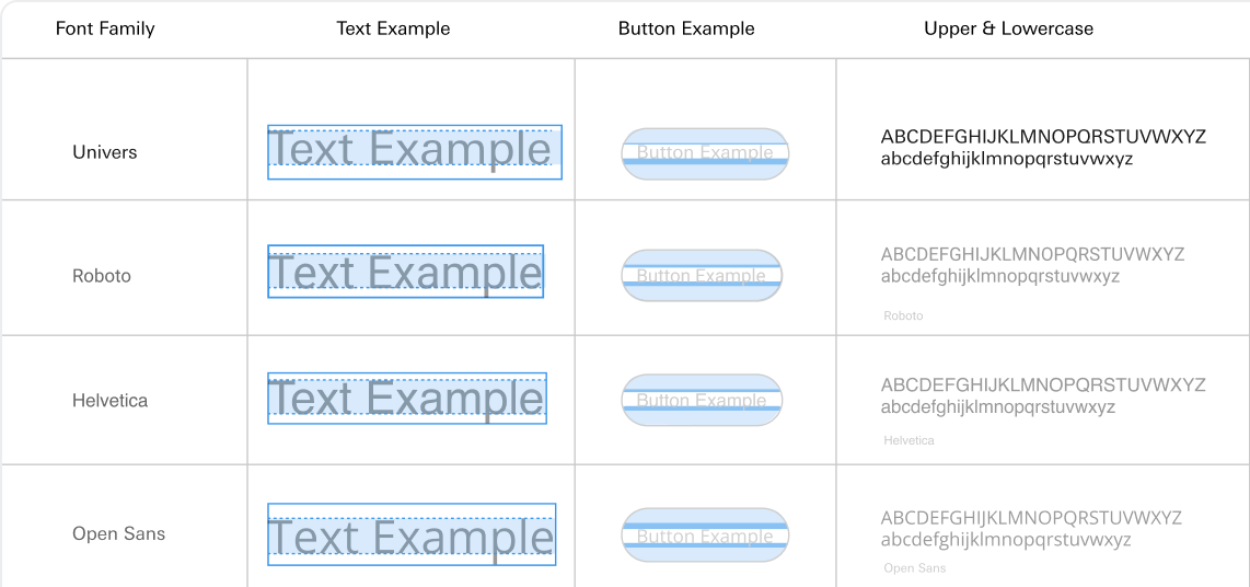
Miller Display
Semi-bold style
Roman
Aa

Aa
H1
Miller Display
Semibold
Insights Hero Title (L/M)
Body2Medium
Univers Next Variable
Medium
Core Body & Subtitle Style
Design decisions were delayed.
Designers & developers wasted time recreating components & debating standards- not solving problems.
Developer handoffs were inefficient
Without documented components, engineering handoff was error-prone and required extra clarification or rework.
Visual and interaction inconsistencies
Without the design system, visual and interaction patterns became inconsistent across the product.
User experience degradation
Inconsistent UI patterns confused users and reduced trust our product’s reliability.

Example color used in component:
Button Example
Token process:

green / 500
The first pass involved grouping values into primitive-based color tokens, ensuring consistent usage across the product.
#007A4C
primary / default
green / 300
The system initially contained a mix of raw color values and inconsistent naming. We identified opportunities to centralize and simplify.
primary / default
During system buildout, we introduced structured naming conventions for tokens to support future scalability and clarity.

Work in progress: Figma variables
primary / default / surface / action-hover
We’re now expanding token structure using Figma variables to align design and development environments more seamlessly.

Foundations
Backgrounds & Logos
Breakpoints & Spacing
Color Palettes
Elevations
Iconography
Typefaces
Type Scale
MUI Components
Alert Banners
Buttons
Checkboxes
Data Visualizations
Date Picker
Dialogs
Generic Cards
Popovers & Menus
Progress Indicator
Radio Buttons
Search Fields & Filters
Skeleton Loader
Switches
Tabs & Tab Groups
Tables
Time Picker
Text Fields & Pin Entry
Toggle Buttons
Tooltips
Unique Components
Account Navigation
Article Previews
Insight Page Elements
Notification Popovers
Left Rail
Site Header + Mobile Menu
Site Footer
Total Assets Cards

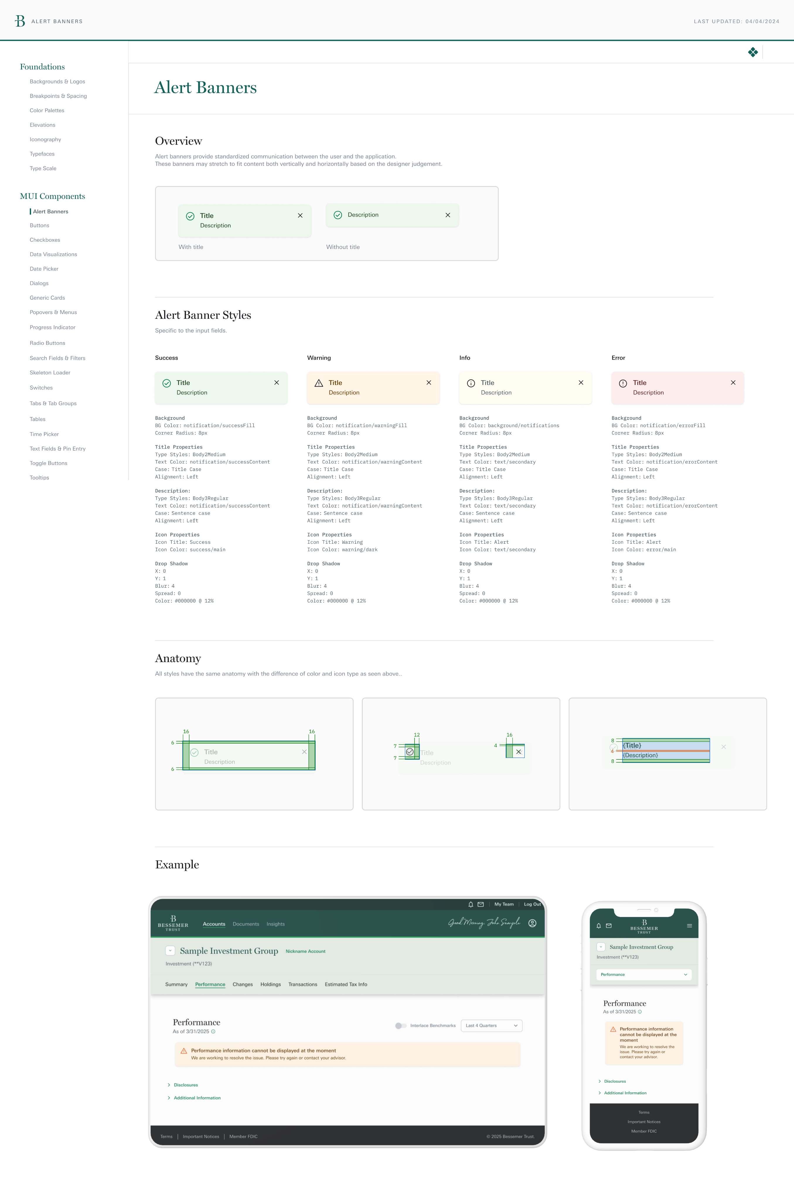
ALERT BANNERS
LAST UPDATED:
04/04/2024


The design system became a shared foundation for both design and engineering.
I led the rollout and alignment strategy, resulting in 100% adoption.
It improved design consistency and reduced redundant pattern creation.
Design QA issues related to inconsistent UI dropped significantly across core flows.
It reduced friction in design-to-dev handoff and sped up implementation.
Engineering leads reported a 30% decrease in back-and-forth during component implementation.
It created a foundation for scaling design efficiently across teams and products.
The system reduced duplication and made it easier to introduce new features without reinventing patterns.
Next project: Prospect experience
Reach out for collaboration,
consulting, or coffee.
n.ingrisano8@gmail.com

Building a scalable design system for a growing financial platform
Primary Colors
secondary/dark
#0D4943
secondary/light
#126159
primary/default
#007A4C
primary/light
#1BA055
text/primary/darkest
#181A1D
text/primary/dark
#505E68
text/primary/medium
#788091
text/primary/defualt
#BCC0C8
text/primary/light
#D7D9DE
Miller Display
Semi-bold style
Roman
Aa

Aa
H1
Miller Display
Semibold
Insights Hero Title (L/M)
Body2Medium
Univers Next Variable
Medium
Core Body & Subtitle Style
Design decisions were delayed.
Designers & developers wasted time recreating components & debating standards- not solving problems.
Developer handoffs were inefficient
Without documented components, engineering handoff was error-prone and required extra clarification or rework.
Visual and interaction inconsistencies
Without the design system, visual and interaction patterns became inconsistent across the product.
User experience degradation
Inconsistent UI patterns confused users and reduced trust our product’s reliability.
Example color used in component:
Button Example
Token process:
green / 500
The first pass involved grouping values into primitive-based color tokens, ensuring consistent usage across the product.
#007A4C
primary / default
green / 300
The system initially contained a mix of raw color values and inconsistent naming. We identified opportunities to centralize and simplify.
primary / default
During system buildout, we introduced structured naming conventions for tokens to support future scalability and clarity.
Work in progress: Figma variables
primary / default / surface / action-hover
We’re now expanding token structure using Figma variables to align design and development environments more seamlessly.
Foundations
Backgrounds & Logos
Breakpoints & Spacing
Color Palettes
Elevations
Iconography
Typefaces
Type Scale
MUI Components
Alert Banners
Buttons
Checkboxes
Data Visualizations
Date Picker
Dialogs
Generic Cards
Popovers & Menus
Progress Indicator
Radio Buttons
Search Fields & Filters
Skeleton Loader
Switches
Tabs & Tab Groups
Tables
Time Picker
Text Fields & Pin Entry
Toggle Buttons
Tooltips
Unique Components
Account Navigation
Article Previews
Insight Page Elements
Notification Popovers
Left Rail
Site Header + Mobile Menu
Site Footer
Total Assets Cards

ALERT BANNERS
LAST UPDATED:
04/04/2024


The design system became a shared foundation for both design and engineering.
I led the rollout and alignment strategy, resulting in 100% adoption.
It improved design consistency and reduced redundant pattern creation.
Design QA issues related to inconsistent UI dropped significantly across core flows.
It reduced friction in design-to-dev handoff and sped up implementation.
Engineering leads reported a 30% decrease in back-and-forth during component implementation.
It created a foundation for scaling design efficiently across teams and products.
The system reduced duplication and made it easier to introduce new features without reinventing patterns.
Next project: Prospect experience
Reach out for collaboration,
consulting, or coffee.
n.ingrisano8@gmail.com
Building a scalable design system for
a growing financial platform
Primary Colors
text/primary/darkest
#181A1D
text/primary/dark
#505E68
text/primary/medium
#788091
text/primary/defualt
#BCC0C8
text/primary/light
#D7D9DE
Miller Display
Semi-bold style
Roman
Aa

Aa
H1
Miller Display
Semibold
Insights Hero Title (L/M)
Body2Medium
Univers Next Variable
Medium
Core Body & Subtitle Style
Overview
Design decisions were delayed.
Designers & developers wasted time recreating components & debating standards- not solving problems.
Developer handoffs were inefficient
Without documented components, engineering handoff was error-prone and required extra clarification or rework.
Visual and interaction inconsistencies
Without the design system, visual and interaction patterns became inconsistent across the product.
User experience degradation
Inconsistent UI patterns confused users and reduced trust our product’s reliability.
Example color used in component:
Button Example
Token process:
green / 500
The first pass involved grouping values into primitive-based color tokens, ensuring consistent usage across the product.
#007A4C
primary / default
green / 300
The system initially contained a mix of raw color values and inconsistent naming. We identified opportunities to centralize and simplify.
primary / default
During system buildout, we introduced structured naming conventions for tokens to support future scalability and clarity.
Work in progress: Figma variables
primary / default / surface / action-hover
We’re now expanding token structure using Figma variables to align design and development environments more seamlessly.
Foundations
Backgrounds & Logos
Breakpoints & Spacing
Color Palettes
Elevations
Iconography
Typefaces
Type Scale
MUI Components
Alert Banners
Buttons
Checkboxes
Data Visualizations
Date Picker
Dialogs
Generic Cards
Popovers & Menus
Progress Indicator
Radio Buttons
Search Fields & Filters
Skeleton Loader
Switches
Tabs & Tab Groups
Tables
Time Picker
Text Fields & Pin Entry
Toggle Buttons
Tooltips
Unique Components
Account Navigation
Article Previews
Insight Page Elements
Notification Popovers
Left Rail
Site Header + Mobile Menu
Site Footer
Total Assets Cards
ALERT BANNERS
LAST UPDATED:
04/04/2024
The design system became a shared foundation for both design and engineering.
I led the rollout and alignment strategy, resulting in 100% adoption.
It improved design consistency and reduced redundant pattern creation.
Design QA issues related to inconsistent UI dropped significantly across core flows.
It reduced friction in design-to-dev handoff and sped up implementation.
Engineering leads reported a 30% decrease in back-and-forth during component implementation.
It created a foundation for scaling design efficiently across teams and products.
The system reduced duplication and made it easier to introduce new features without reinventing patterns.
Next project: Prospect experience
Reach out for collaboration,
consulting, or coffee.
n.ingrisano8@gmail.com